Brand Identity
Client -
BroCode Cafe

OVERVIEW
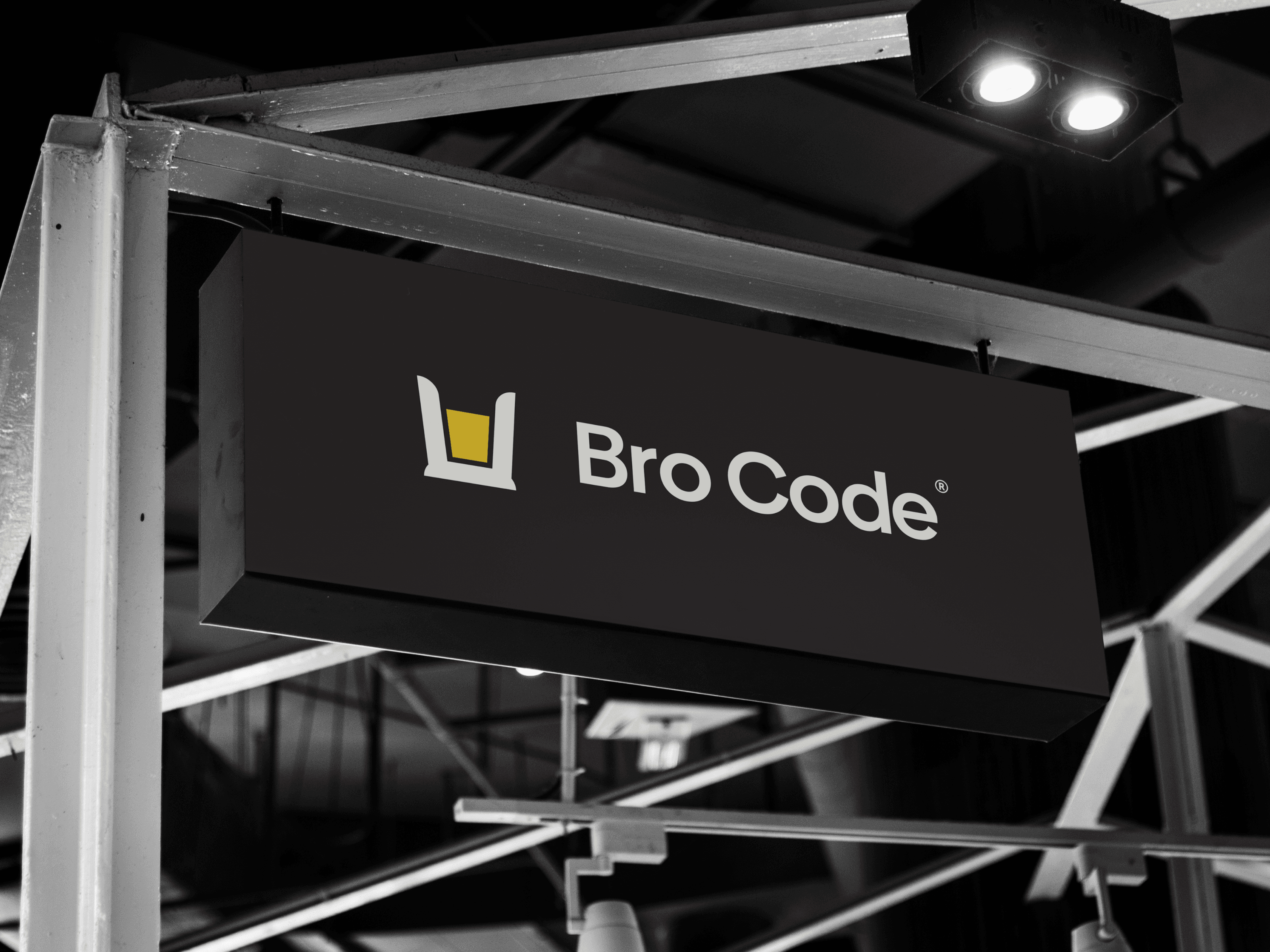
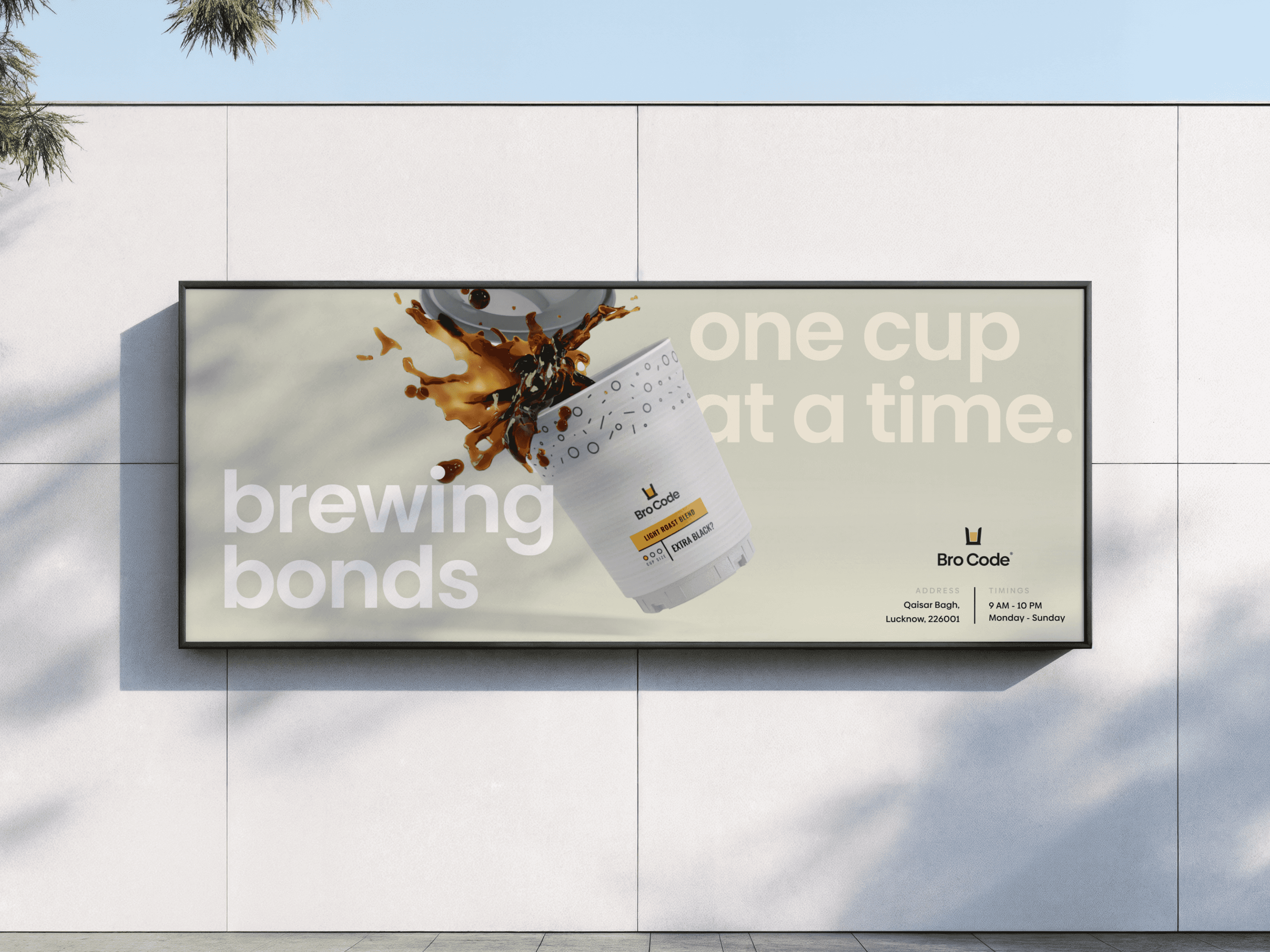
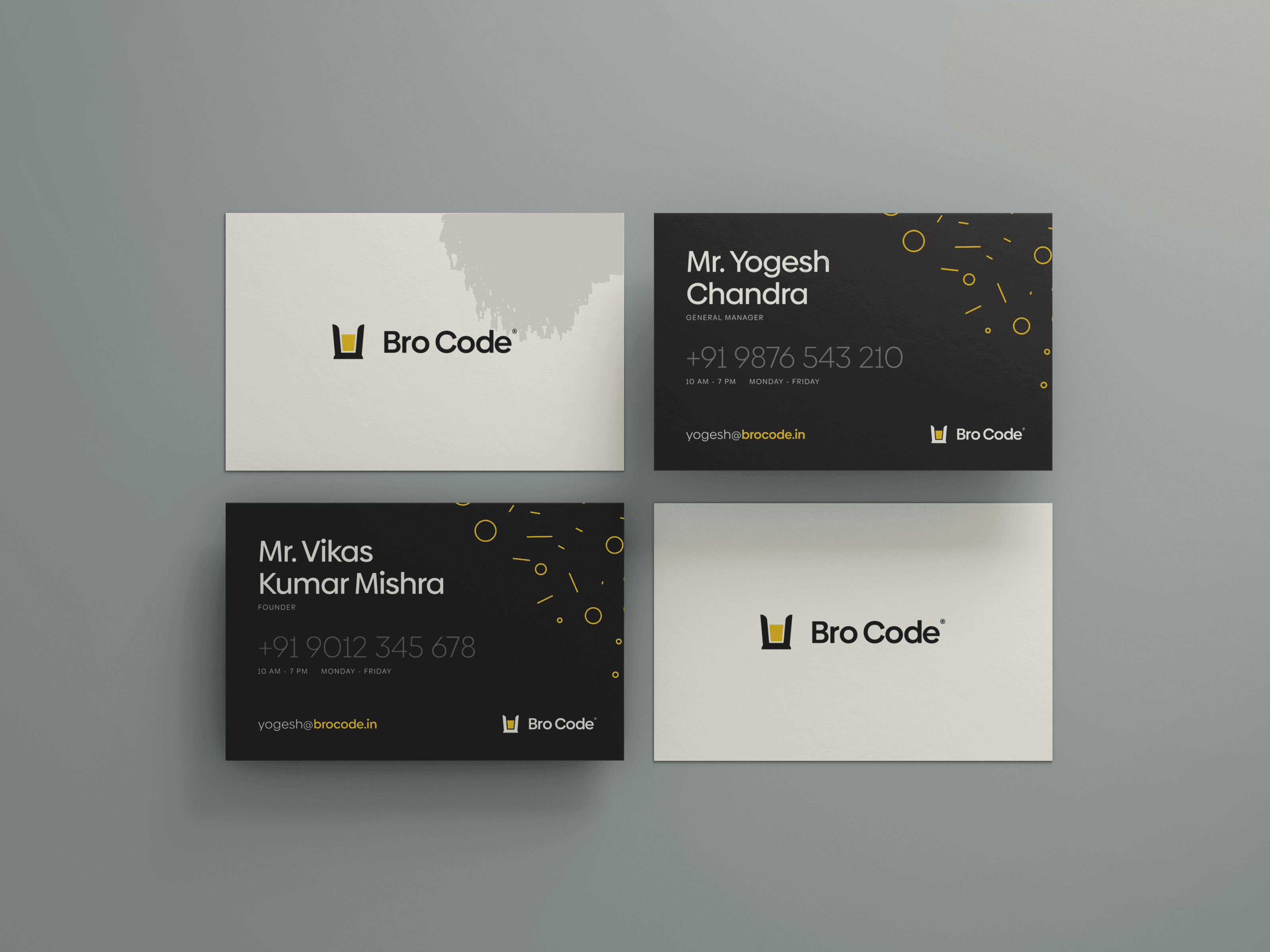
When a local cafe needed a name and an identity that fosters a sense of brotherhood, friendship and belonging, we gave them just that. Bro Code started as an experiment. They were able to take this identity to seed investors and expand their growth in short time-frame. They weren't looking for an expansive and expensive set of brand assets (although we'd love to do that for them). They were looking for something small and special with a quick turn around.


CHALLENGE
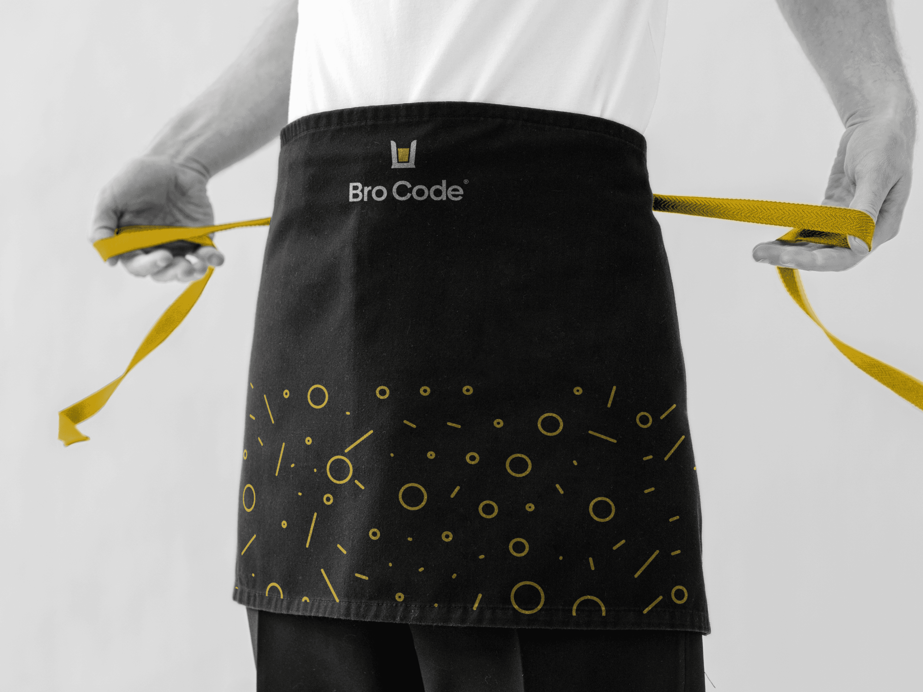
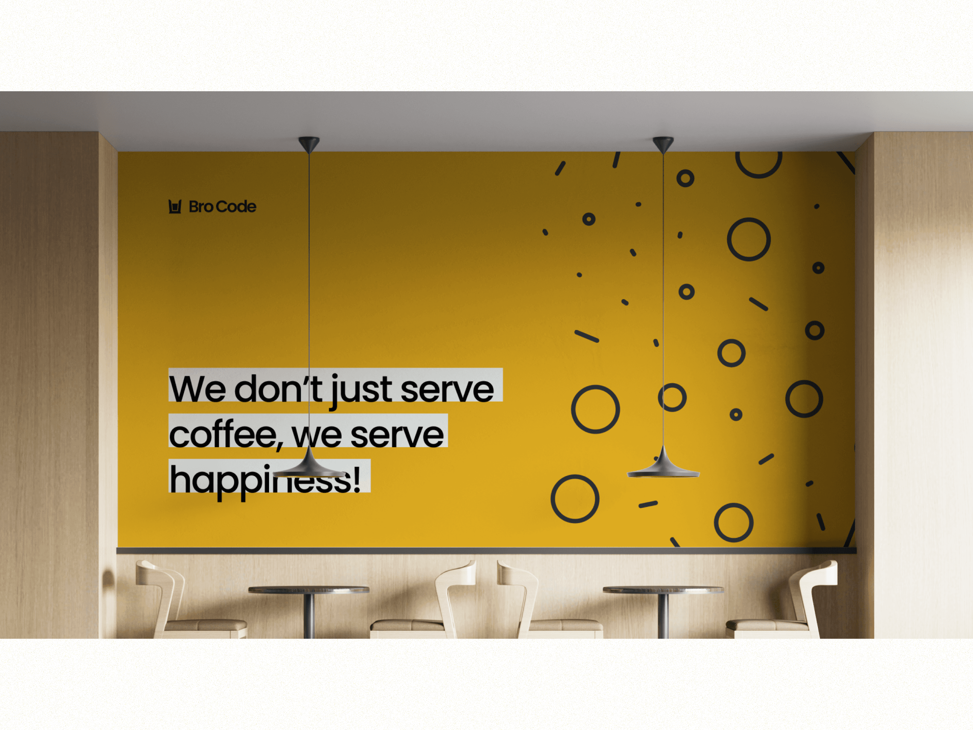
The challenge was to create a brand that looks modern and warm at the same time. It should be a taste of something new, yet familiar. This project challenged us to think a little bit outside the box. The biggest challenge was finding an appropriate color. We used a bold and bright yellow specifically because it is associate with 'beer', which is highly associated with bond.


solution
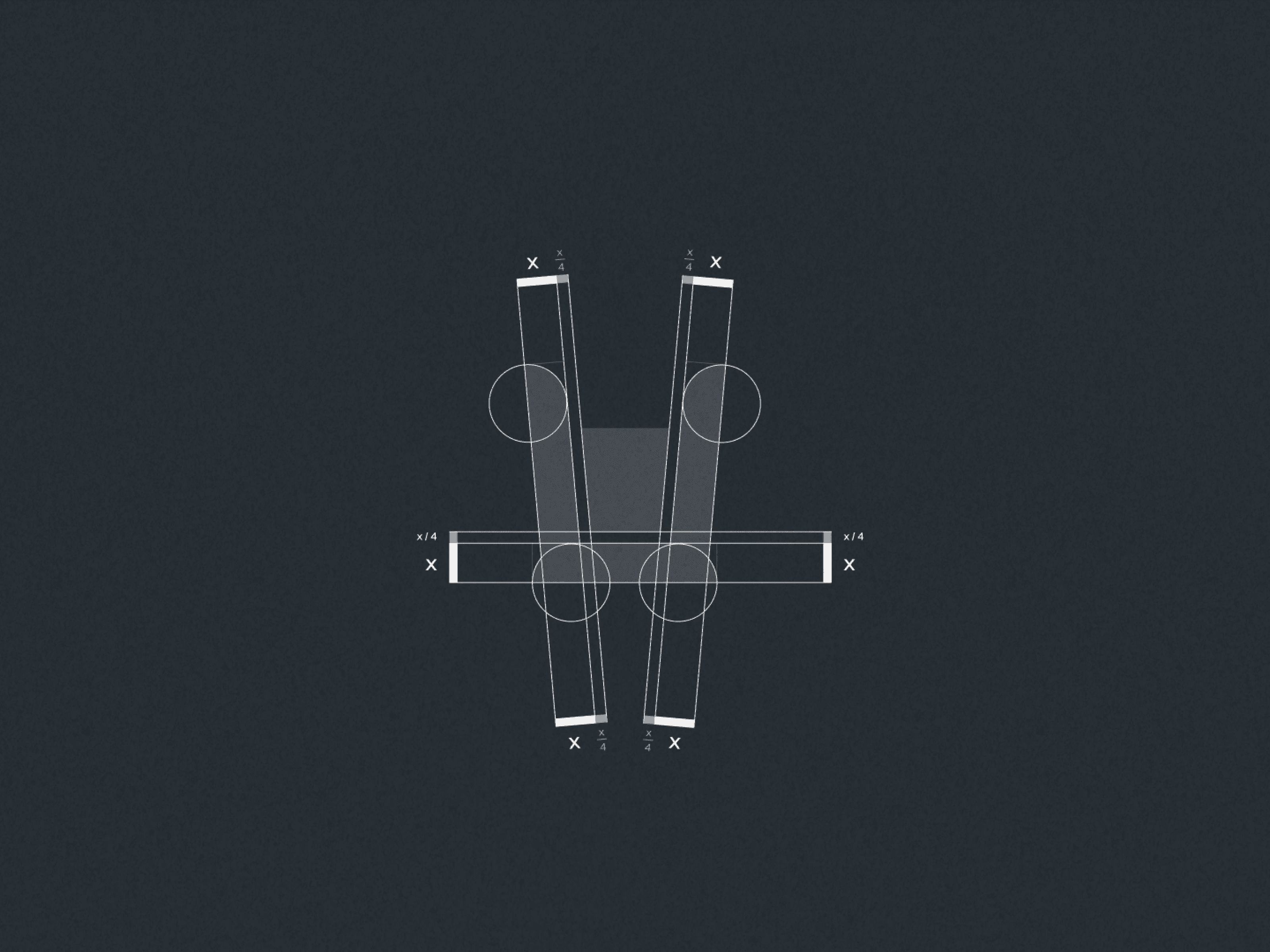
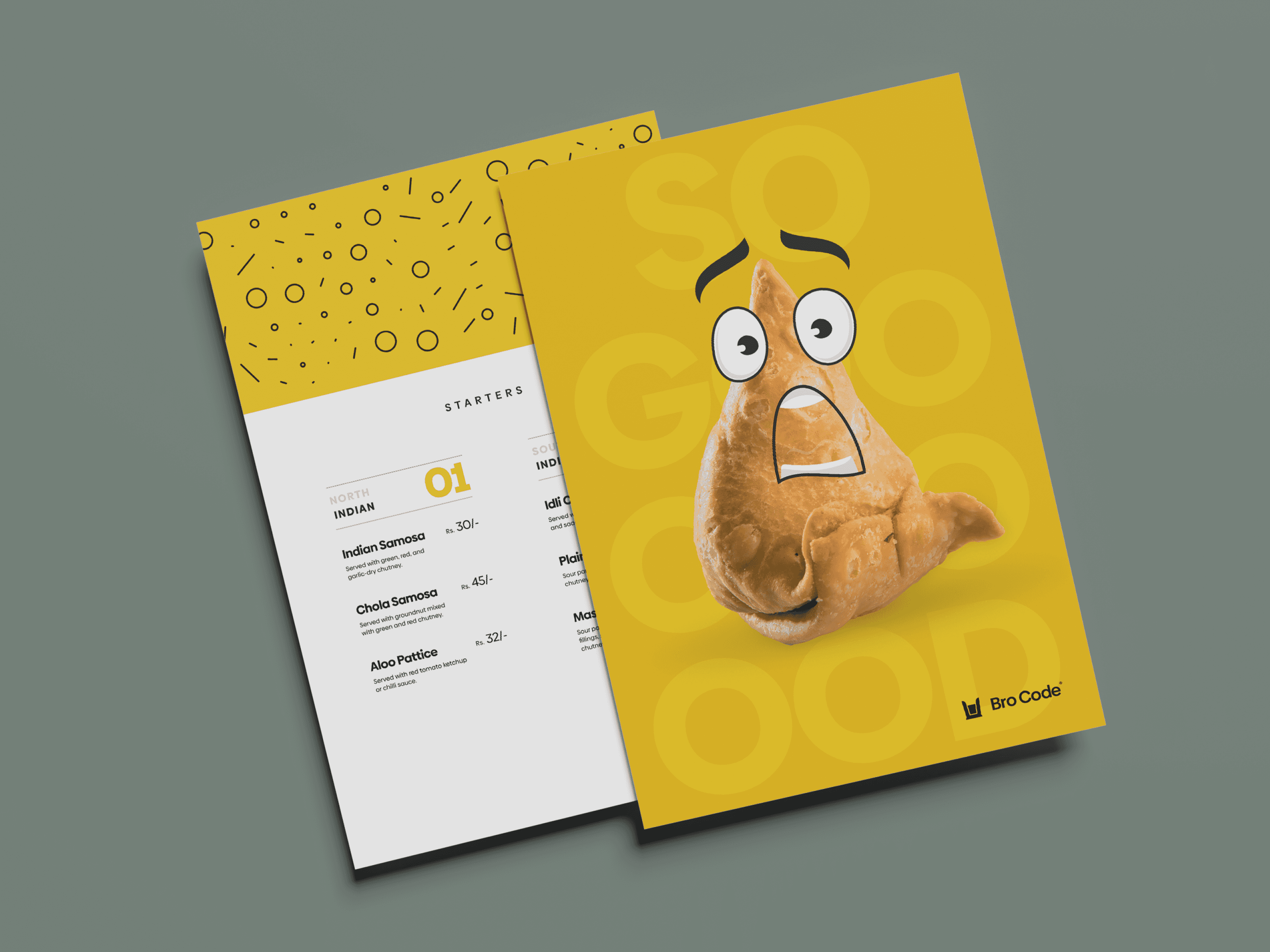
We came up with a font family (Biennale) that supports variability. It gives a sense of familiarity to the users while still retaining geometric shapes that give a fresh look to the collaterals. We designed their menu to be a bit playful. Since the Menu is hardly ever seen as an individual asset, it is almost always seen while receiving the full cafe experience, we had a more than little leeway to be creative. We created animated avatars out of famous snacks in India (i.e. Samosa).