Visual Design
Client -
Stone Soup / Fast & Up

OVERVIEW
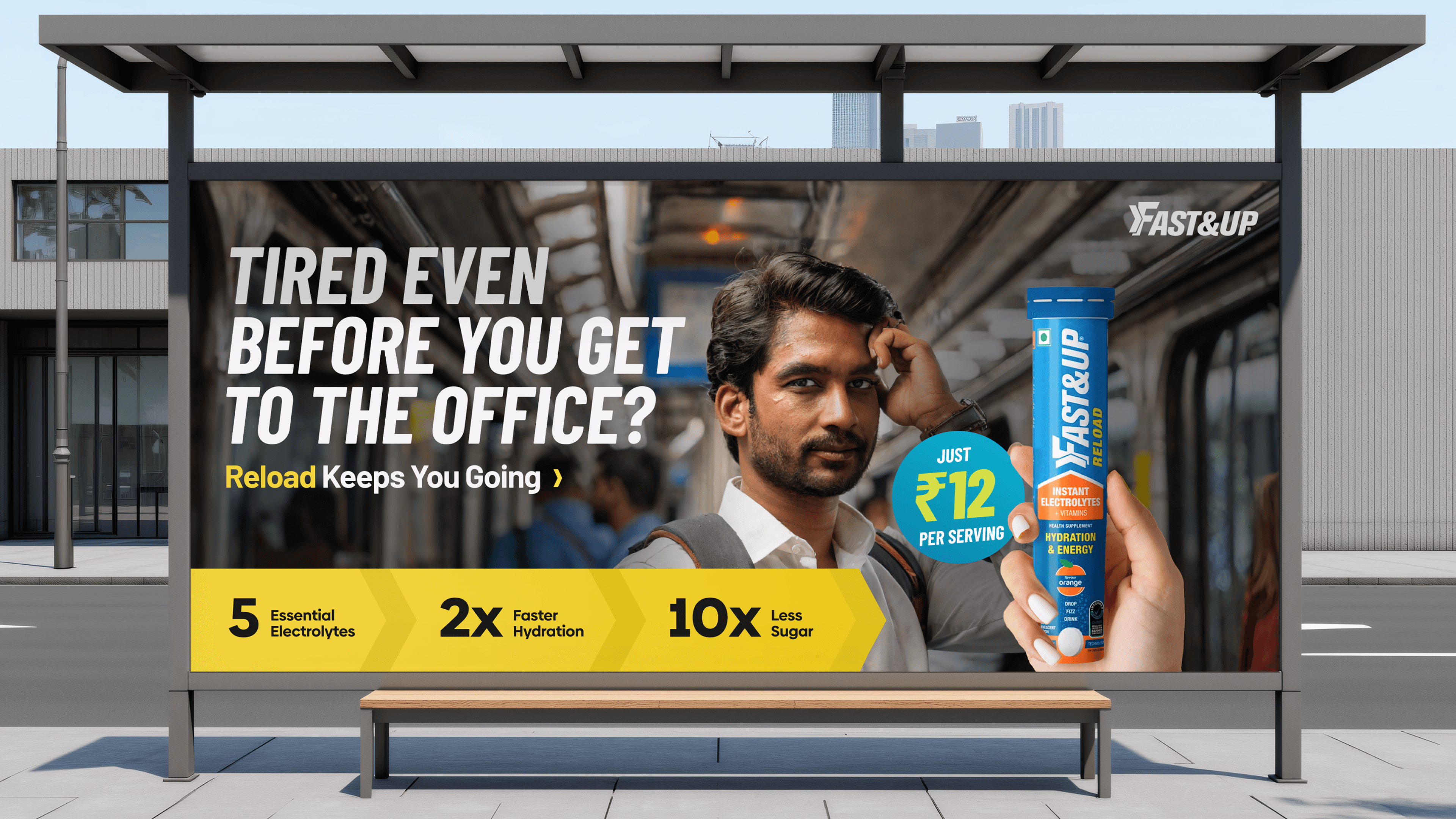
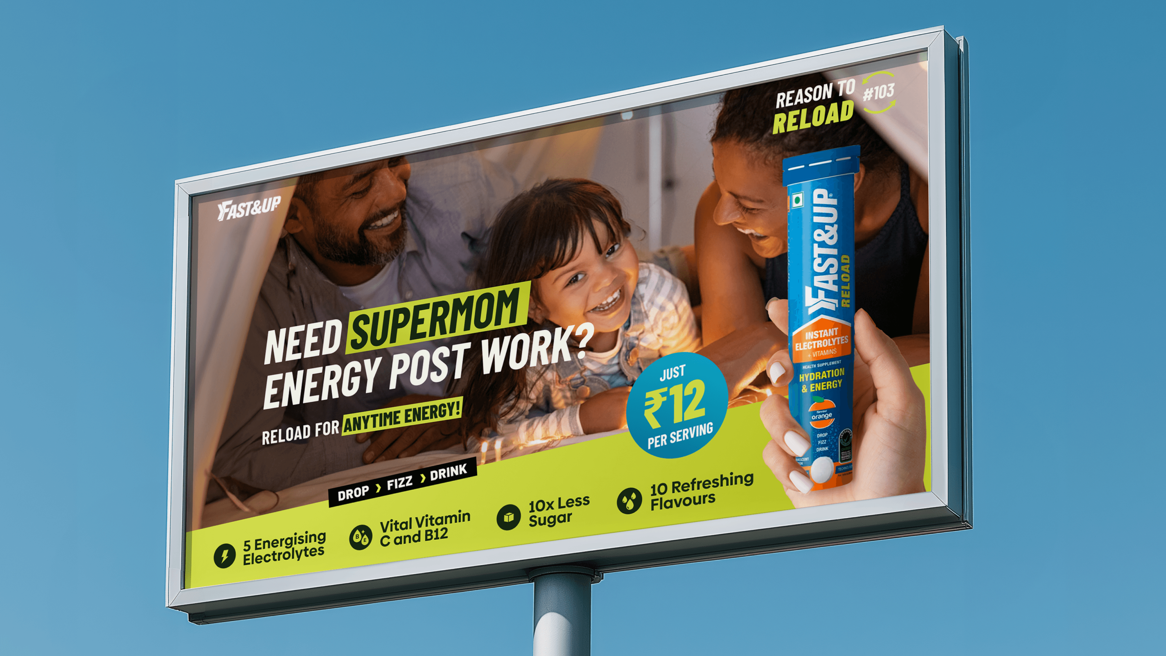
Talented folks of Stone Soup asked us to transform some sharp copy in their “Reason to Reload” pitch for Fast&Up’s electrolyte drink. We delivered some high-energy creatives.


CHALLENGE
Fast&Up Reload is a low-sugar effervescent tablet packed with five essential electrolytes plus Vitamins C and B12, designed for quick hydration and energy on the go. Stone Soup’s idea was to show that the drink isn’t just for athletes but for anyone who hits a slump—whether that’s chasing a gym crush, powering through post-work parenting, or surviving yet another meeting. Our brief was simple: craft key visuals that make those everyday “reload” moments impossible to miss and impossible to forget.


solution
We leaned into Fast&Up’s bold blue-and-orange palette, then injected a fluorescent yellow highlight that echoes the brand’s product sleeve while doubling as a visual highlighter for the punchlines. We delivered a ready-to-pitch OOH toolkit: three master key visuals tuned for gym, office, and home scenarios, plus an adaptable design system that lets Stone Soup swap headlines or stats without redrawing the layout. Layered PSDs, colour references, and animation cues ensure the campaign can jump from static hoardings to digital banners while preserving the same vibrant punch.